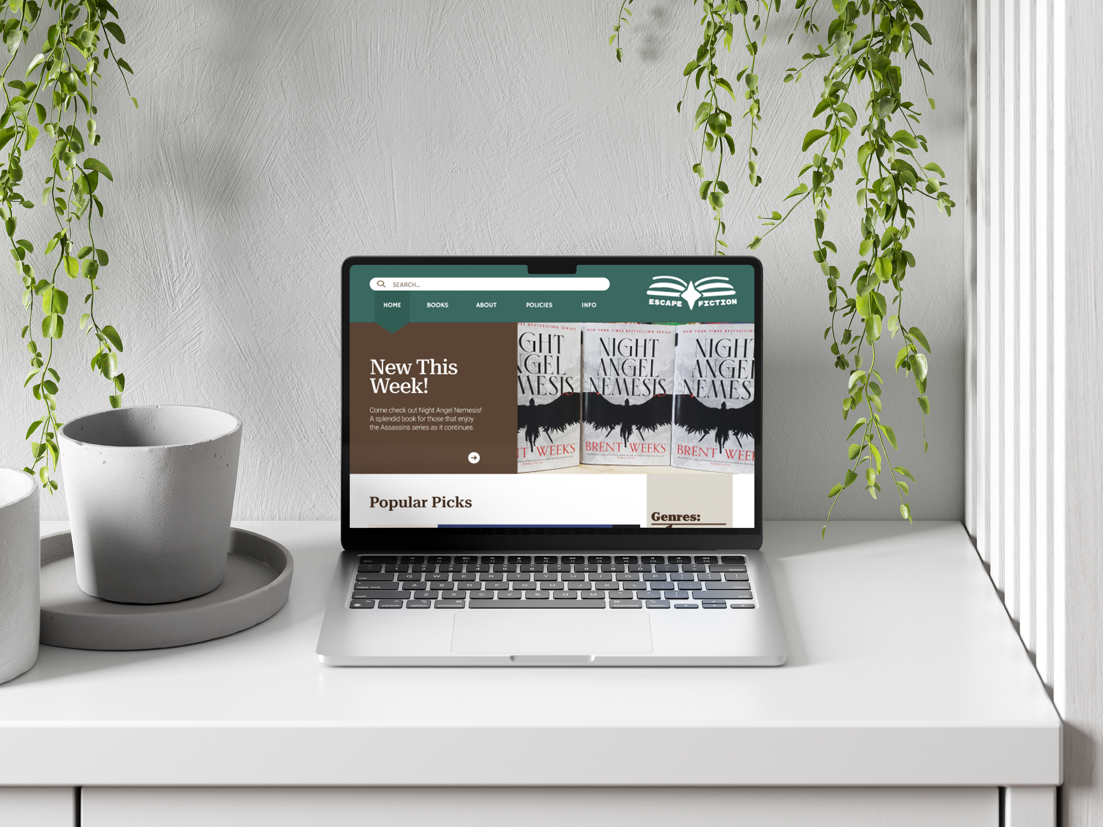
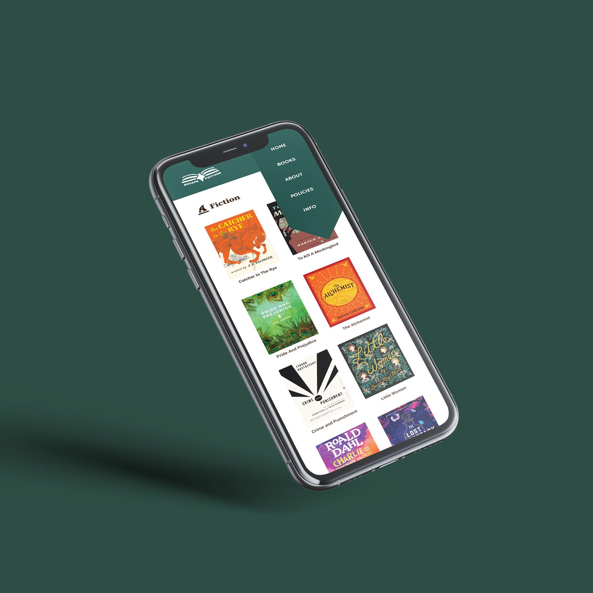
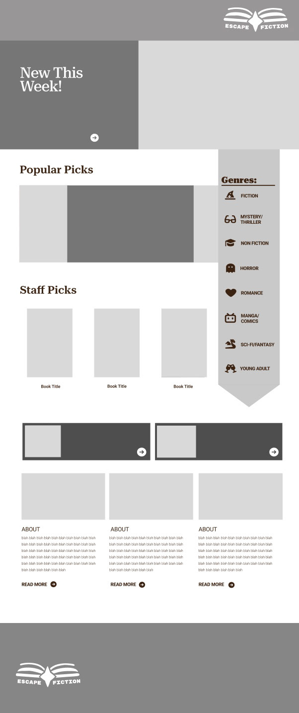
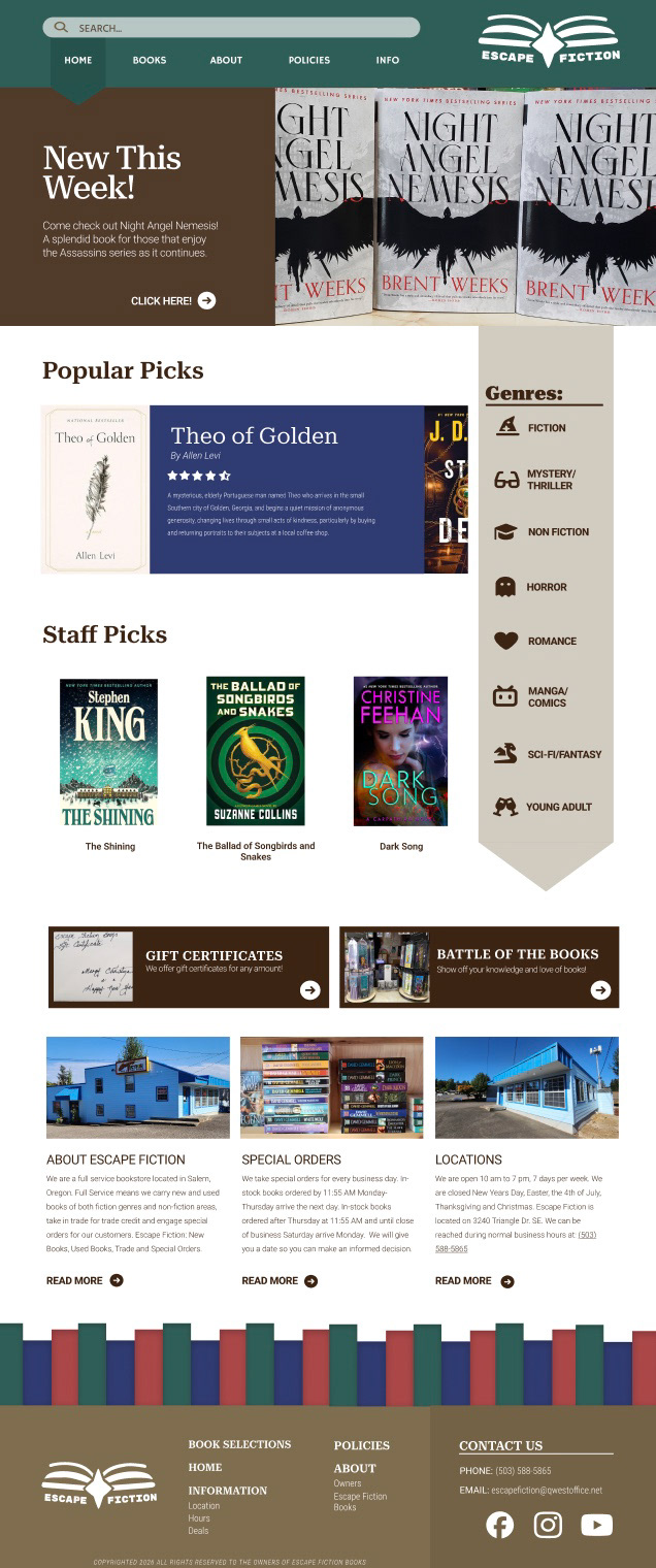
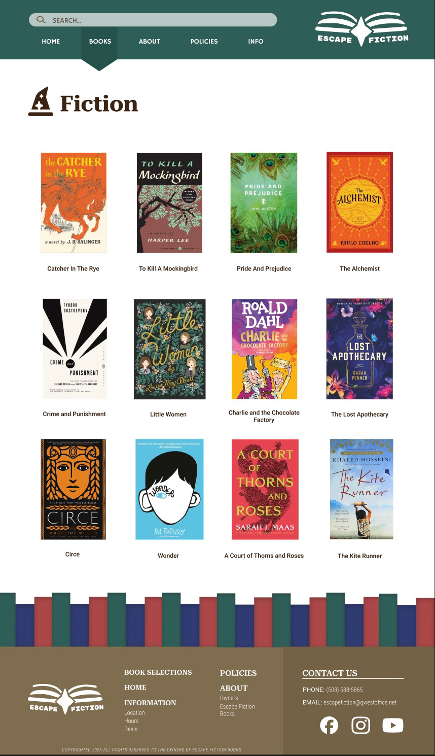
CHALLENGE: Refresh the book store “Escape Fiction” website into something more clear and readable. Make sure to streamline the website's overall wireframe.
SOLUTION: I refreshed the logo to match the brand of Escape Fiction and to be more versatile. For the main website design the palette of teal and brown are the main colors. This is to match that fun and authentic feel you get when you walk into the store.